Web design trends are a double-edged sword. Following them thoughtfully keeps your website feeling current and meeting evolving user expectations. Following them blindly creates websites that feel dated within months and prioritise novelty over usability. At WebAnchor Studio, we evaluate every design trend through a practical lens: does it improve the user experience, support business goals, and age gracefully? This article examines the most significant web design trends of 2025 and our honest assessment of which ones deserve your attention.
Trend: Bento Grid Layouts
Bento grid layouts, inspired by Japanese lunch boxes with neatly organised compartments, have become one of the defining visual patterns of 2025. These layouts use asymmetric grid arrangements where cards of different sizes create visual interest while maintaining a structured, organised feel. Apple popularised this pattern on their product pages, and it has since spread across industries from technology to hospitality.
Our verdict: adopt thoughtfully. Bento grids work exceptionally well for pages that need to present multiple types of content, such as features pages, dashboards, or portfolio showcases. The asymmetry creates natural visual hierarchy, drawing attention to larger cards while maintaining an organised structure. However, they require careful planning for responsive design. A bento layout that looks intentional on a wide screen can feel random or broken when columns collapse on mobile. We use bento grids when the content naturally suits varied emphasis and always design the mobile layout first to ensure it works at every breakpoint.
Trend: AI-Generated and Dynamic Content
AI-powered personalisation is increasingly common in web design, from dynamically generated product recommendations to chatbots that handle customer enquiries. Some sites now use AI to generate or modify content based on the visitor's behaviour, location, or stated preferences. This trend is driven by advances in large language models and the decreasing cost of AI inference.
Our verdict: use with caution. AI-powered features can genuinely improve user experience when implemented thoughtfully. A chatbot that answers common questions outside business hours provides real value to visitors. Product recommendations based on browsing history can increase average order values. However, AI-generated text that replaces carefully crafted copy often feels generic and impersonal. Visitors can tell when content was not written by someone who understands the business. We use AI as a tool to enhance specific interactions rather than as a replacement for authentic, intentional content creation.
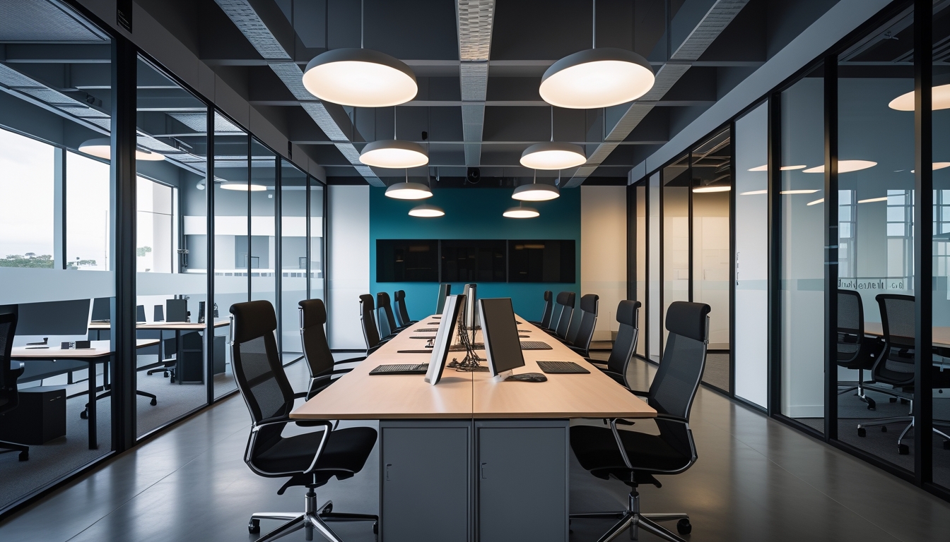
Trend: Micro-Interactions and Motion Design
Micro-interactions are small animations triggered by user actions: a button that subtly changes shape when hovered, a notification badge that bounces when updated, a form that gently shakes when submitted with errors. When used with restraint, micro-interactions provide feedback that makes interfaces feel responsive and alive. Motion design extends this concept to larger animations that guide users through transitions, reveal content progressively, and add personality to the experience.
Our verdict: strongly recommended with restraint. Micro-interactions are one of the clearest examples of a trend that genuinely improves usability. They provide feedback that helps users understand the result of their actions. A button that responds visually to a click confirms that the click was registered. A form field that highlights when focused clearly shows where input will appear. The key word is restraint. Every animation should serve a purpose, run quickly, and respect the prefers-reduced-motion media query for users who are sensitive to motion. Sites that animate everything end up feeling frantic rather than polished.
Trend: Dark Mode and Colour Mode Options
Offering dark mode as an option rather than a single fixed colour scheme has become an expected feature on many types of websites. Operating systems and browsers now expose the user's preference through the prefers-color-scheme media query, allowing websites to automatically match the system setting. Some sites go further with multiple colour themes or high-contrast modes for accessibility.
Our verdict: recommended for appropriate sites. Dark mode reduces eye strain in low-light environments, can extend battery life on OLED screens, and is strongly preferred by many users. For applications, dashboards, documentation sites, and content-heavy platforms where users spend extended time, dark mode is a genuine usability improvement. For marketing sites and landing pages where the visit is typically brief, the development effort of maintaining two colour schemes may not be justified. If you implement dark mode, design it intentionally rather than simply inverting colours. True dark mode design requires careful attention to contrast ratios, colour psychology, and shadow treatment.
Trend: Oversized Typography and Editorial Design
Large, bold typography used as a primary design element has been growing steadily and continues strong in 2025. This trend draws from editorial and magazine design, where type itself creates visual impact and establishes brand personality. Headlines spanning the full viewport width, mixed typeface pairings, and creative use of type weight and spacing all fall under this umbrella.
Our verdict: recommended for brand-focused sites. When your brand identity is strong and your messaging is clear, oversized typography creates immediate impact and memorability. It works particularly well for creative agencies, fashion brands, luxury services, and any business where personality and confidence are part of the value proposition. The risk is readability. Extremely large text on mobile devices can create awkward line breaks, and decorative typefaces that look stunning at display sizes can become difficult to read at body text sizes. We pair bold display typography with clean, highly readable body text to maintain impact without sacrificing usability.
Trend: Glassmorphism and Frosted Glass Effects
Glassmorphism uses transparency and blur effects to create UI elements that appear to be made of frosted glass, allowing background content to show through dimly. This creates a sense of depth and layering that feels modern and sophisticated. The effect is achieved through CSS backdrop-filter and has broad browser support in 2025.
Our verdict: use sparingly. Glassmorphism can add visual sophistication to specific elements like modal dialogs, navigation bars, and floating cards. It creates a clear visual distinction between foreground and background content, which can improve readability when implemented correctly. The risks are performance and accessibility. The backdrop-filter property can be expensive to render, particularly on mobile devices, causing scroll jank and increased battery consumption. Transparency can also compromise text readability if the background content behind the glass element is visually complex. We use glassmorphism for discrete UI elements rather than as a pervasive design language, and always test performance on lower-end devices.
Trend: Sustainable and Performance-First Design
The growing awareness of the internet's carbon footprint has spawned a movement toward sustainable web design. This encompasses reduced page weight, fewer HTTP requests, optimised images, minimal JavaScript, green hosting, and design decisions that prioritise efficiency over visual excess. Performance-first design treats page speed and data efficiency as primary design constraints rather than afterthoughts.
Our verdict: essential and enduring. This is not a trend in the traditional sense. It is a long-overdue correction. The average web page has grown significantly over the past decade, and much of that growth has been unnecessary. Lighter, faster websites are better for users, better for search engine rankings, better for conversion rates, and better for the environment. We approach every project with a performance budget that constrains page weight and load time, making conscious decisions about which visual elements justify their performance cost. This is the one trend on this list that we believe every website should follow without qualification.
Key Takeaways
The best web design trends are those that improve user experience rather than simply following fashion. Bento grids create effective visual hierarchy when planned carefully. AI features add value in specific interaction contexts but should not replace authentic content. Micro-interactions improve usability when used with restraint. Dark mode serves users in the right contexts. Bold typography creates brand impact when paired with readable body text. Glassmorphism adds sophistication to discrete elements. And sustainable, performance-first design is not a trend but a responsibility. At WebAnchor Studio, we adopt trends that serve our clients' users and skip the ones that serve only novelty. Your website should feel current and professional, not trendy and disposable.